Widget types
Below is shown the list of all the widget types currently supported by the dashboards of the manager applications:
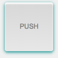
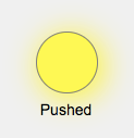
Button widget
A push button that can invoke a function when it is pressed and when it is released.
- button-id: a string that represents the button identifier that this widget will send to the exterior functions as the data argument. By default is null.
- label: the text to show on the button. Default value is 'PUSH'.
- font-family: the font family of the text. Supported values are "lcd", "monospace" and "fontawesome" but additional families may also be supported.
- font-size: the font size of the text in pixels. Default value is 14.
- on-pressed: the exterior function to call when the button is pressed.
- on-released: the exterior function to call when the button is released.
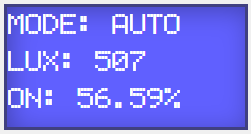
Display widget
A multiline text display.
- lines: the number of lines of the display. Default value is 3.
- font-family: the font family of the text. Supported values are "lcd", "monospace" and "fontawesome" but additional families may also be supported.
- get-value: the exterior function that provides the text to show.
EditText widget
A component to edit text.
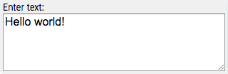
- label: the text to show above the edit box. By default label is an empty string.
- font-family: the font family of the text. Supported values are "lcd", "monospace" and "fontawesome" but additional families may also be supported.
- font-size: the font size of the text in pixels. Default value is 14.
- get-value: the exterior function that provides the text to edit.
- set-value: the exterior function that will be called when the text changes. That text is passed to the exterior function as argument.
- invoke-interval: the minimum time in milliseconds between two consecutive calls to the set-value external function.
- auto-scroll: the type of automatic vertical scrolling to apply when the text of this widget is changed. Its value can be "top" to scroll top or "bottom" to scroll bottom. Any other value maintains the previous scroll position.
Gauge widget
A circular gauge with a needle that represents a numeric value within a range.
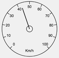
- label: the text to show inside the gauge.
- min: the minimum value of the gauge. Default value is 0.
- max: the maximum value of the gauge. Default value is 100.
- divisions: the number of divisions painted on the gauge (must be greater than 4). Default value is 10.
- decimals: the maximum number of decimals to show for the value. By default is 0.
- get-value: the exterior function that provides the value of the gauge.
Graph widget
A widget that plots the values of multiple datasets in time scale. The time range can be changed dinamically dragging the mouse up and down. A mouse double click starts/stops the graph animation.
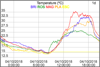
- label: the text to show on top of the graph widget.
- time-range: the visible time range that must be one of the following values: 1s, 5s, 20s, 1m, 5m, 30m, 1h, 4h, 8h, 12h, 1d, 1w, 4w, 1y.
- max-data: the maximum number of values to retain for each dataset. Default value is 1000.
- date-format: a Java date pattern to specifiy the date format. Default value is "dd/MM/yyyy".
- dataset-names: a string that contains the names of the datasets to plot, separated by spaces.
- get-value: the exterior function that returns the current values to
plot for all datasets. The returned value can be: a single number or a list according to these
formats: (dataSetName? => value+) or (dataSetName? => (value timestamp)+).
Examples:
25.34(25.34)("tem" => 22.5 "pre" => 1023.4 "hum" => 78.3 ...)("tem" => (22.5 1525190567927) "pre" => (1023.1 1525190567927) ...)
- get-history: the exterior function that provides the historic values to
plot. That function must return a list according to this format: (dataSetName? => ((value timestamp)+)+)
where values are ordered from oldest to newest.
Example:
("x" => ((8.45 1525190567927) (7.41 1525190569231) ...) "y" => ((-2.65 1525190567927) (-1.08 1525190569231) ...))The graph widget only calls get-history function the first time it is displayed and then it refreshes its contents when the get-value exterior function provides new data.
Image widget
A widget to display images and videos.
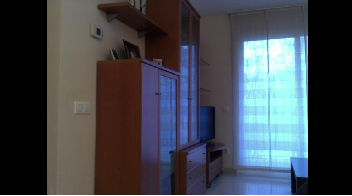
- url: the exterior function that provides the url of the image or video to display. The supported image formats are JPEG, PNG and GIF. The only supported video format is MJPEG.
Indicator widget
A widget to show an indicator value.
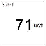
- label: a string representing the title of the indicator that is displayed on top of its value. By default no title is shown.
- get-value: the exterior function that provides the value of the indicator.
- font-family: the font family of the indicator value. Supported families are "lcd", "monospace" and "fontawesome" but other may also be supported.
- units: a string that indicates the units of this indicator. No units are displayed by default.
- max-value-length: the maximum number of characters of the indicator value that will be displayed. If max-value-length is 0, the font size of the indicator value will be adjusted to fit all its characters.
Led widget
A led indicator that turns on and off depending on the value of a exterior function.
- label: the text to paint under the led.
- get-value: the exterior function that provides a boolean value than determines the state of the led.
- color: the color of the led in hexadecimal format: #RRGGBB. Default color is yellow (#FFFF00).
Range widget
A slider control that allows you to select a numeric value within a range. Changes in the server are also reflected in the slider.
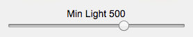
- label: the text to show above the range control.
- min: the minimum value of the range. Default value is 0.
- max: the maximum value of the range. Default value is 100.
- get-value: the exterior function that provides the value of the range.
- set-value: the exterior function that will be called when the slider is changed. The argument passed to that function is the current value of the range.
Select widget
A component that allows you to select a value from a list of options. Changes in the server are also reflected in the widget.
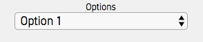
- label: the text to show above the selector.
- get-options: the exterior function that provides the list of options.
Each option is a list with 2 elements, the value to send to the server and the label to display, both are strings.
Example:
(("1" "Option 1") ("2" "Option 2") ...) - get-value: the exterior function that provides the current value of the select widget.
- set-value: the exterior function that will be called when the selected option changes. The argument passed to that function is the value of the current option.
Stick widget
A stick control designed to drive robots, drones and other mobile objects.
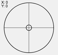
- set-value: the exterior function to call when the stick position changes. The argument passed to that function is a list (x y) that contains the horizontal and vertical position of the stick, both in the range (-100, 100).
- invoke-interval: the minimum time in milliseconds between two consecutive calls to the set-value external function.
Switch widget
A switch button with two states, ON and OFF.

- label: the text to show beside the switch button.
- get-value: the exterior function that provides the current state of the switch (a boolean).
- set-value: the exterior function that will be called when the state of the switch changes. The data argument passed to that function is a boolean representing the current state of the switch.